

Html beginner’s tutorial – part 3
Building your lay-out with Cascading Style Sheets
This is the third part in our html beginner’s tutorial. We will continue to build on the previous two tutorials. If you missed out on one of those, feel free to get yourself acquainted with the very basics of html and the most important html5 tags to build the structure of your webpage.
- Html beginner’s tutorial – part 1 – Getting to Hello World
- Html beginner’s tutorial – part 2 – Building the structure of your webpage with html-tags
In this tutorial we will introduce an indispensable part of webdesign: Cascading Style Sheets (CSS). If you want to grow as a webdeveloper, you will find out very soon that a decent knowledge of this programming language is an absolute must. This makes the title of the tutorial no longer 100% accurate, since it’s more a CSS tutorial than a html tutorial but you will see the tight connection between the two and why one cannot go without the other.
What are Cascading Style Sheets (CSS)
CSS is a programming language that allows you to automate the look of your website and to transform the flat html-structure we made in part 2 into a full-fledged lay-out. The information about CSS on the web is unmeasurable, way too much to cover in this tutorial. So if you feel overwhelmed from time to time in this course, do not panic. CSS is not too difficult to learn and with some excercise, you will get your head around it pretty quick.
The files with the finished result of this tutorial can be downloaded here but obviously we encourage to you to begin with the finished file of part 2 and use that as a starting point for this tutorial so you can follow step by step.
First create folders and structure
In the previous two tutorials, we worked with a single file but from now on, additional files will come into play. Technically, you are making a structured website, so it’s important to start using best practices right away. Create a new folder on your desktop and give it a random name. Put the index.html file from the previous part into that folder. This folder will function as the ‘root folder’ of your website, where all subfolders and files will be put into. Now create two more folders into your root folder and name them css and images respectively.
The moral of the story is this: create folders, folders, folders! Give these folders names that make sense. Websites and web applications can rapidly become pretty complex, so you understand the need to know where each part of your website is located. Although it’s not mandatory to give these folder the names you just did, it is important for you to understand there are some widespread conventions in webdesign and why you should adopt these. Css-files are commonly stored in a folder called ‘css’, images are stored in a folder called ‘images’ or ‘img’ and so on.
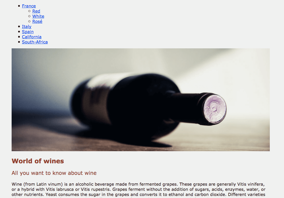
Now open your favourite html editor and create a new blank file. Save it right away as style.css in the css folder. We will also insert an image into our webpage, you can download it here. You can use any image you want, but be sure it measures 1000px width to 400px height. Save this image into the images folder.
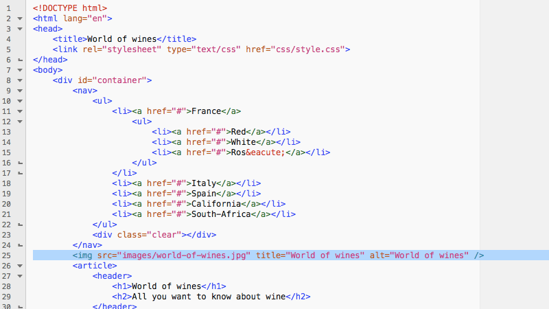
Use your favourite html editor to open index.html (the file you completed in the previous tutorial). We will now link style.css to index.html. We will also write some code to insert the image into the html file. On line 5 of index.html, insert the code to link the stylesheet:
<link rel="stylesheet" type="text/css" href="css/style.css">This will link the style.css file in the css-folder to index.html. Now add the image too. On line 25, right underneath the closing nav-element, write the code to insert the image.
<img src="images/world-of-wines.jpg" title="World of wines" alt="World of wines" />The <img> element is something we haven’t coverd yet. Notice this element has no closing tag, contrary to other html-elements. Also note the title and alt attributes. The title is what appears when you hover with the mouse over the image. The alt will display when the image cannot be loaded. Keep in mind that an alt-attribute is mandatory for images to be html-compliant (althought you do are not obliged to write anything between the quotes).
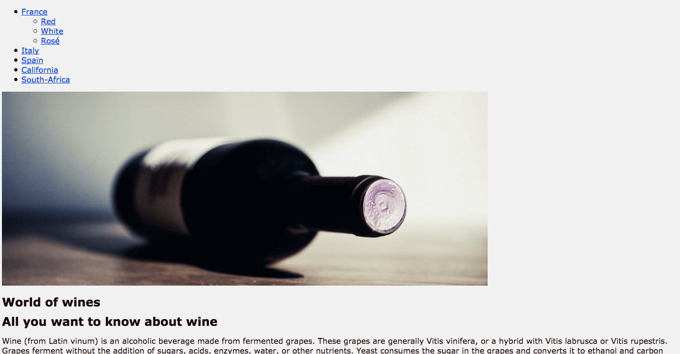
When you open index.html with your favourite browser, you will see it still displays boring text, now with an image crammed into it. But this is about to change. Keep the file open in your browser so you can follow every change that is going to occur from now on.
Writing the css-code
In your html-editor, go back to the blank css-file you created and write the following code:
html {
background: #f0f0f0;
position: relative;
z-index: 1;
}
body {
font-family: Verdana, Arial, sans-serif;
font-weight: 400;
font-size: 16px;
line-height: 20px;
color: #1E0000;
position: relative;
z-index: 2;
}
.clear {
clear: both;
}
When you refresh index.html in your favourite browsers, you will notice some changes have occured: the background colour is now a light grey and all the flat text is now writte in another font. So let’s break down what happened here:
The html selector:
The html element is the highest entity of your webpage. First, we gave it a background colour. The alphanumerical value behing the hash-tag is a hexadecimal code. Hexadecimal codes vary from #000000 (black) to #ffffff (white). The position and z-index are not mandatory but it’s good practice to add these straight away.
The body selector:
The body element is next up in your document’s hierarchy. This selector is commonly used to define the typeface, font-size, font-weight and other stuff that is applicable in the rest of your document. A quick tip here: you see we gave the font a color, close to black but not quite full black. Never put your flat text in plain black: it’s boring and it makes it harder to read. If you give it a colour that fits in the color scheme of your website, the user experience will be much better.
The .clear selector
One element stands out here that doesn’t seem to fit into the document hierarchy. Notice the dot. This indicates it points to a ‘class’ in your html-document. If you take a look to your html-document in your html-editor, you will notice two divs (on lines 23 and 56) with class=”clear”. More on this later on.
Go back to style.css in your html editor and add the code for the h1, h2 and paragraph:
h1 {
font-size: 24px;
line-height: 28px;
color: #9D331F;
font-weight: bold;
}
h2 {
font-size: 20px;
line-height: 26px;
color: #9D331F;
font-weight: 400;
}
p {
margin-top: 20px;
}
Refresh the page in your browser again and see how the main title and the sub title have changed. We gave them a colour and changed their font sizes. The h1 is given extra weight by making it bold. Also note the top margin we give to the paragraph. It makes the text more readable.
Go back to style.css in your html-editor and add the code to style the container element:
#container {
width: 1000px;
margin: 0 auto 20px;
position: relative;
z-index: 3;
}
When you refresh the page in your browser, you will notice a huge difference. This selector defines the look and position of the div-element we gave the name ‘container’. We give it a defined width of 1000 pixels. Note the specifications for the margins: this is a shorthand notation. The 0 marks the margin form the top, ‘auto’ defines the left and right margins and 20px defines the bottom margin. Note that we write 0 for zero pixels, not 0px. The easiest way to remember this is the ‘trouble-trick’: Top-Right-Bottom-Left. In your browser you see we now have a boxed lay-out perfectly centered horizontally. Also note we have added the position and z-index as well. The z-index allows you to build layers in your page (remember we gave html z-index 1 and body z-index 2).
Go back to your css-file and add the code for the main navigation.
nav {
background: #500805;
position: relative;
z-index: 4;
}
nav ul {
position: relative;
z-index: 5;
padding: 0;
}
nav ul li {
display: inline;
position: relative;
list-style-type: none;
font-size: 0;
line-height: 0;
z-index: 6;
float: left;
}
nav ul li a {
color: #fff;
text-decoration: none;
font-size: 18px;
line-height: 22px;
display: block;
padding: 15px 20px;
position: relative;
z-index: 7;
}
nav ul li a:hover {
background: #BC6D4F;
}
nav ul ul {
position: absolute;
display: none;
top: 52px;
left: 0;
z-index: 99;
}
nav ul li:hover ul {
display: block;
background: #9D331F;
}
nav ul ul li{
width: 100%;
}
nav ul ul li a:hover {
background: #500805;
}
That’s a huge chunck at once but take a look in your browser and see how the main navigation has changed form a dull bulleted list into a real navigation.
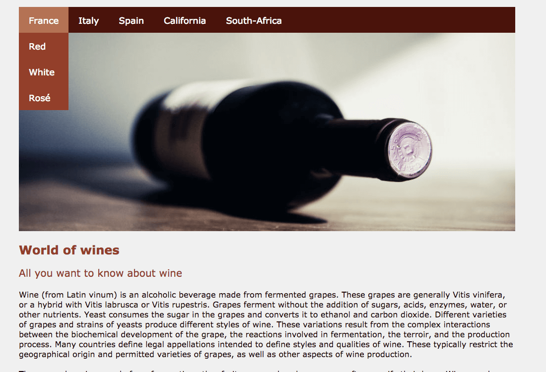
There’s a lot that happes here: first, we give the nav-element a background colour and a position. Next, we tackle the unordened list (the ul-element). The most important things happens on the list items (li-element). By giving them and inline display and let them float to the left, the elements are ordened horizontally instead of vertically as they do by default. Did you notice we also defined that no list style types have to be displayed, thus overruling the default setting. Also note we put font-size and line-height to zero, since we will define these on the nested a-elemente, which contains the actual hyperlink. If you take a look to the code in your index.html file, you will see a div is added here with a class ‘clear‘. This is important to re-order the elements and restore the document flow after we have floated them (either left or right). By ‘clearing’ them, we tell the document no other elements can be displayed left or right from them.
The a-element
We start by giving these a white color, again with a shorthand notation. It is interesting to note that when 6-digit hexadecimal numbers appear in pairs of two, you can use a shorter code. #ffffff can also be written as #fff, which is plain white. We put the text-decoration to none, thus erasing the default line underneath a hyperlink. The most important thing here is the display:block. This makes the whole range around the a-element clickable, not just the text itself. We use padding to play a bit with the width and height of the elements.
Pseudo-selectors
The next interesting thing happens when we hover over one of the navigation items. Notice they change colour. In css, we define these with a pseude-selector. Do you see that we have defined a different colour when somebody hovers a navigation item?
The sub-navigation
We also put a sub navigation under the first list item. This makes it alle more elaborated since these elements have to be defined separately. We give it an absolute position, 52 pixels from the top. Pay attention to the display: none definition, meaning it won’t be visible when the page loads. When somebody hovers the element, we change the display to block, thus outlining the elements vertically. A different background color makes it more distinct. We can then again play around with colors on hover.
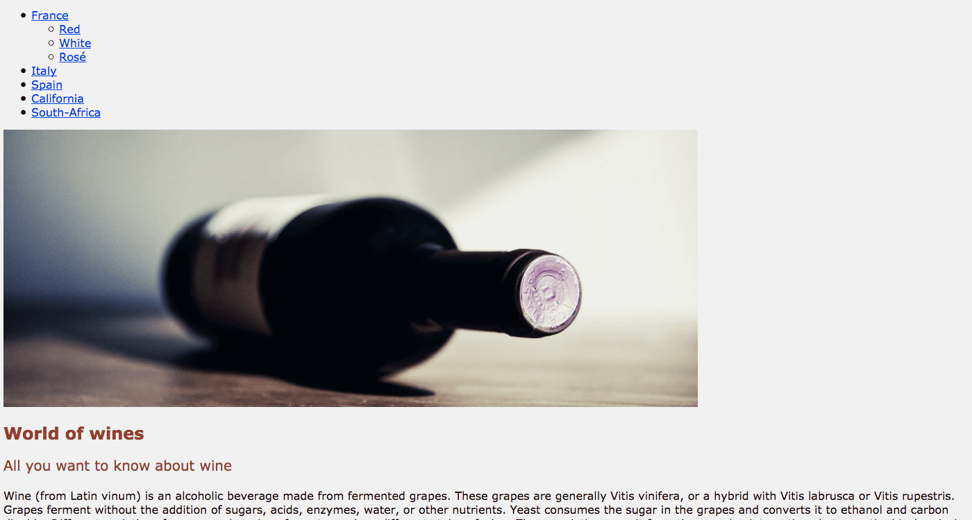
The navigation now sticks to the image we added. So we are going to put some space between them.
img {
imargin: 20px 0 40px;
}
The article element and the sidebar
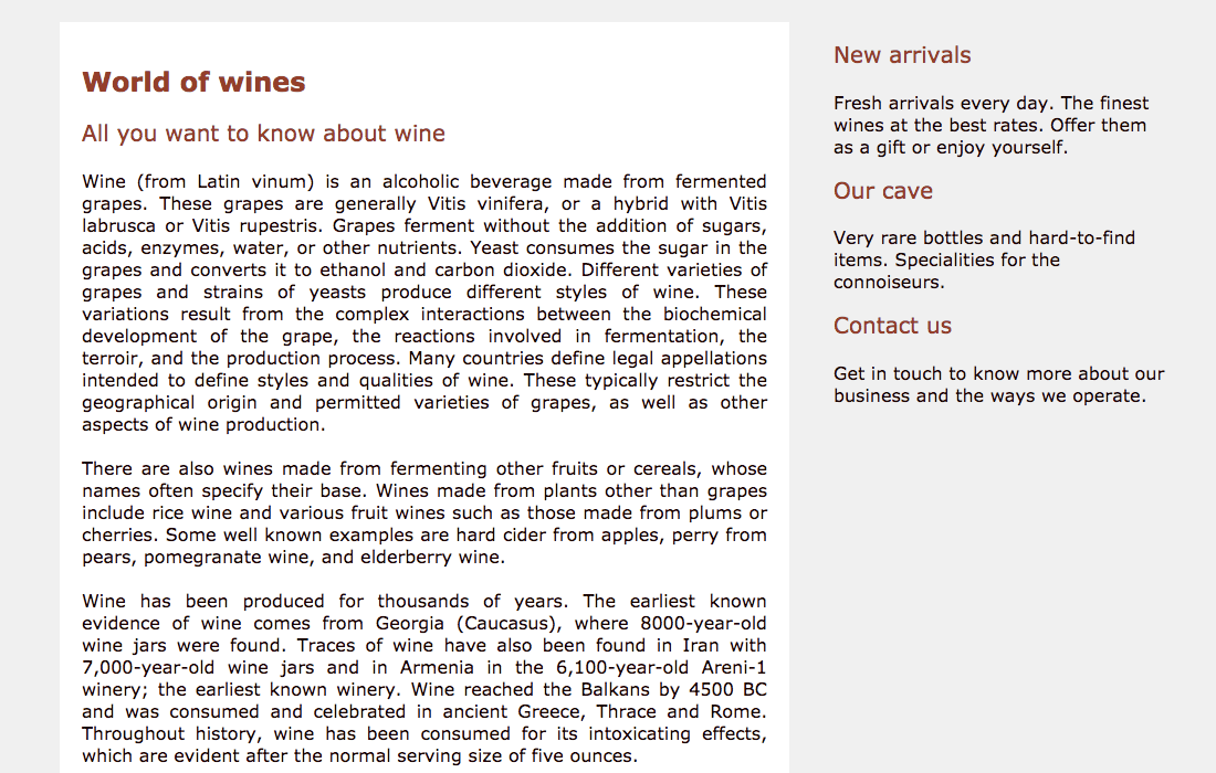
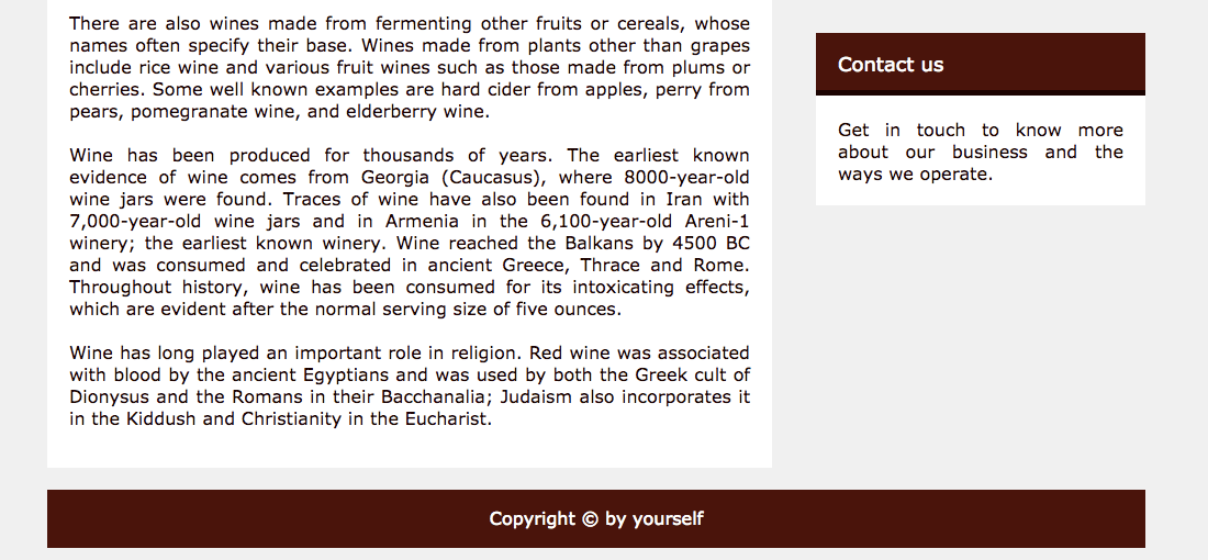
All the content of the page is now boxed and centered but there is still no difference between a main part and a secondary sidebar. We will tackle this now by adding extra code to style.css.
article {
background: #fff;
float: left;
padding: 20px;
width: 620px;
text-align: justify;
margin: 0 0 20px;
}
aside {
float: right;
width: 300px;
position: relative;
}
When you refresh your browser, you will see a lot has changed. We now have a distinct separation between the main content on the left and the sidebar on the right.
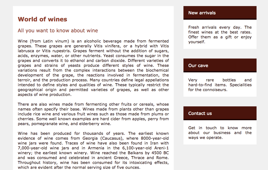
The elements in the sidebar are not properly styled yet, that’s what we’ll do next.
/*Styling the section elements in the aside element*/
section {
background: #fff;
text-align: justify;
margin-bottom: 40px;
}
section header {
background: #500805;
border-bottom: 5px solid #1E0000;
padding: 2px 20px 0;
}
section h2 {
color: #fff;
font-size: 18px;
line-height: 20px;
}
section p {
padding: 0 20px 20px;
}
Refresh your browser: the section-elements in the sidebar are now properly styled as well.
This leaves us with just the footer to deal with.
/*The footer element*/
footer {
background: #500805;
color: #fff;
text-align: center;
padding: 15px 0 18px;
}
footer p {
margin: 0;
}
Refresh your browser one more time to see the completed result.
That was a lot of coding but you now have an html page that really begins to look like a proper website.


